
Members need a fast way to jump into a collection, What’s New, or a curated filter without digging through menus. Content Stacks puts that navigation on the page as a grid of photo stacks--tap a stack, land in the right browse view.
This post shows how to add the block, configure stack sources, and preview what members see. Stacks are navigation, not a Content Showcase layout--Showcase keeps carousel, grid, and rails.
What Content Stacks is
Content Stacks is a Navigation block in the Page Builder. One block holds multiple stacks. Each stack has its own source:
Collection -- opens that collection’s landing page (
/category/…). Count badges can appear on collection stacks.Cohort -- What’s New, Most Loved, Top Rated, Popular, Recently Updated, or Featured →
/browse?cohort=….Filter Preset -- a named preset from App Station → Features → Filters →
/browse?preset=….
There is no separate View All control--the whole stack card is the click target. Visual entry points like this match how strong catalog sites use image tiles to orient people before a full product grid, as covered in Baymard’s category-page guidance and homepage and navigation research.
Where to start
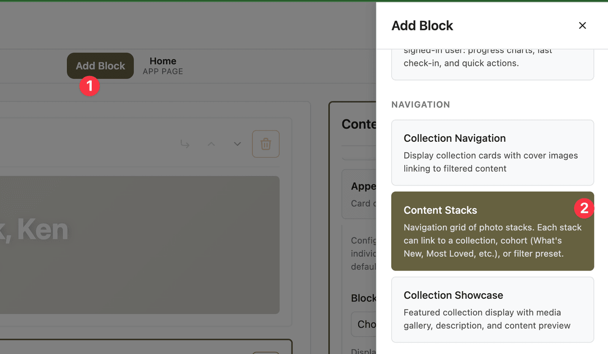
Open App Station → Pages & Menu, choose the page you want (home, library, or a landing page), then open the Page Builder tab. Click Add Block and pick Content Stacks from the Navigation category.
If you are new to blocks and layouts, start with design your app with the Page Builder.
How it works
Select the Content Stacks block to open its config panel. Optional: set a block title above the grid. Under Stacks, add items--each is labeled Stack 1, Stack 2, and so on. You can reorder or remove stacks from that list.
For each stack, choose Source:
Cohort → pick a Retrieval Strategy (What’s New, Most Loved, etc.).
Collection → pick a collection (create collections first if the list is empty).
Filter Preset → pick a preset (create them under Features → Filters; see saved filter presets).
Stack imagery comes from content in that source so the fan of photos matches what members will browse. Preset and cohort stacks omit count badges because results can change with filters and member context.
What to configure
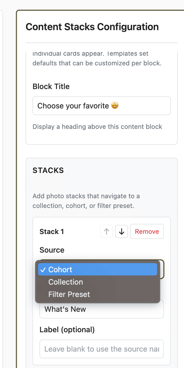
Block title (optional heading above the stacks)
Two to six stacks is usually enough for a home row--mix collections and cohorts for variety
At least one Filter Preset stack if you already use named discovery sets (High Protein, Quick Weeknight, etc.)
Page placement: often near the top of home or a list page, above denser Content Showcase rails or grids
Note: Older Content Showcase configs that used a stacks layout now fall back to carousel. Use Content Stacks for photo-stack navigation going forward.
What members see
Members see a responsive grid of stack cards--fanned recipe (or content) photos with a label chip. Tapping a stack opens the collection landing page or the display-only /browse view for that cohort or preset (sheet on mobile). No search or filter UI on browse--just the curated set behind the stack.
Quick-start checklist
Open the target page in App Station → Pages & Menu → Page Builder.
Add Block → Content Stacks.
Add Stack 1: Source = Cohort → What’s New (or Most Loved).
Add Stack 2: Source = Collection → pick a featured collection.
Optional: Add Stack 3: Source = Filter Preset → pick a saved preset.
Preview the page, tap each stack, confirm destinations.
Publish or save the page when it looks right.
For a short screen recording of the same flow, watch the Content Stacks demo.