The Page Builder is how you shape what members see when they open your app: home screens, recipe libraries, landing pages, and more. Instead of a fixed layout, you stack blocks on each page, configure them, reorder them, and connect pages to your menu. This post walks through where to work in App Station, which blocks to start with, and how pages relate to content and card layouts.
Once recipes are in the library—via PDF, Word, or WPRM import or manual entry—use Content Grid blocks on home and library pages so members see them immediately.
What the Page Builder is (and what it is not)
The Page Builder is your visual editor for tenant pages—the screens members navigate inside your branded app. Each page is a ordered list of blocks (for example a welcome banner, a search bar, and a grid of recipes). You are not editing individual recipes or meal plans here; you are deciding how that content is presented on a page.
Three related areas often get grouped mentally as “the Page Builder,” but they live in different tabs under Pages & Menu:
Pages (List Pages or Landing Pages) — layout members see at a URL.
Content Layouts — how a single recipe, meal plan, resource, or other item looks on its detail screen.
Card Layouts — how items appear as cards inside grids and showcases.
Think of it as: pages arrange blocks; layouts define the card and detail experience those blocks pull from.
Pages & Menu: where you start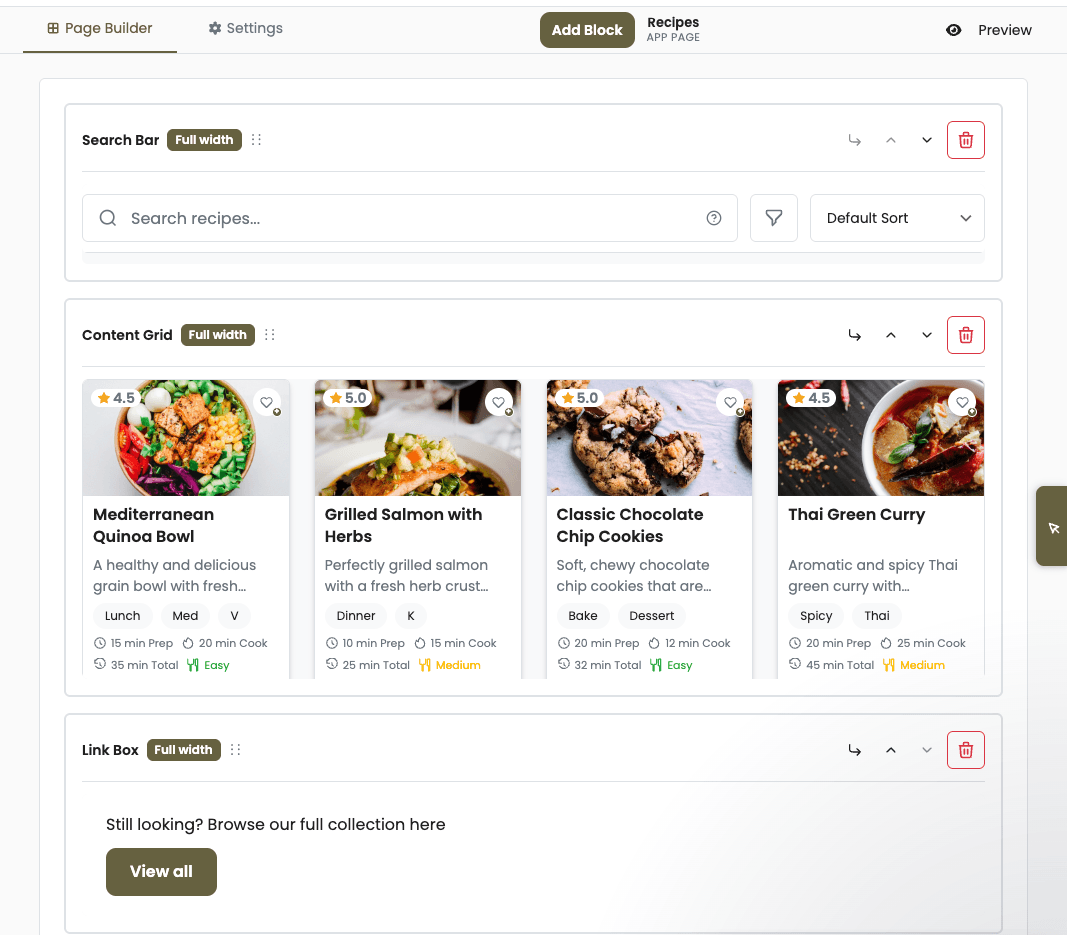
In App Station, open Pages & Menu. You will see tabs for Menu, Landing Pages, List Pages, Content Layouts, Category Layouts, and Card Layouts.
Landing Pages — Marketing-style pages (promos, about, signup flows). Available on all plans, with plan limits on how many you can create.
List Pages — App pages members use day to day: home, libraries, hubs. Creating and editing these fully requires the Page Builder feature on your plan (Growth has the broadest access).
Open any page to edit it. The page editor has two main tabs:
Page Builder — add blocks, configure them, and drag to reorder.
Settings — title, slug, publish state, and other page metadata.
The header shows whether you are editing an App Page or a Marketing Page, plus actions such as Preview when your plan includes it.
Blocks: the building blocks members actually see
Add the This Week block to your home page so members see their weekly schedule current and next weeks without browsing the full library.
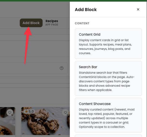
On the Page Builder tab, click Add Block to open the block drawer. Pick a block, configure it in the panel, and drag blocks up or down to change order. Changes stay in the editor until you publish from Settings; if you have unpublished edits, you will see Unpublished changes in the toolbar.
A practical starter set for most apps:
Welcome Hero — personalized greeting on a home or dashboard page.
Content Grid — filterable grid or list of recipes, meal plans, resources, and other content types.
Search Bar — standalone search that drives filters on the same page (see next section).
Content Showcase — curated rows or featured picks when you want editorial control.
Hero Section, About Section, Call to Action — marketing blocks for landing pages and promos.
Many other blocks exist (feeds, collection navigation, wellness widgets, journey steps, and more). You only need a handful to ship a credible home page and library; add specialized blocks as your offer grows.
Search and grids on the same page
Members often expect search on the same screen as browseable content. The pattern is:
Add a Search Bar block near the top of the page.
Add one or more Content Grid (or Content Showcase) blocks below.
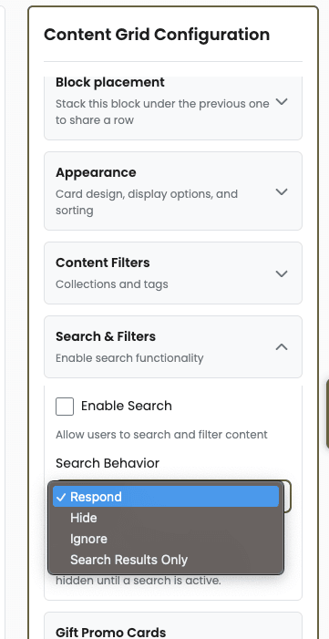
Configure each grid’s search behavior:
Respond (default) — the grid filters when someone searches.
Hide — the block disappears during search (useful for promos you do not want in results).
Ignore — the block always shows its content, regardless of search.
Search-only — hidden until search is active; good for a dedicated results area.
The Search Bar does not render results itself—it updates the page URL so grids on that page react. That is why one search field can control multiple sections on a single home or library page.
Pair Search blocks with Saved Presets so discovery feels curated—not like a generic recipe catalog.
Layouts beyond a single page
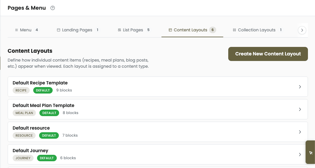
When a member taps a recipe card, they leave the page builder canvas and open a detail view shaped by a Content Layout (for example Recipe Header, Recipe Ingredients, Recipe Instructions). When they see cards in a grid, the card’s look comes from a Card Layout for that content type.
Category Layouts control collection (category) landing pages. You do not have to perfect every layout on day one—default layouts from onboarding are enough to launch—but knowing the split helps: tune cards for scanability, tune detail layouts for cooking flow, tune pages for discovery.
Menu, publish, and preview
Pages only help members if they can reach them. Use the Menu tab under Pages & Menu to add links, nest items, and point entries at the pages you built. Icons and order control how your app feels in the bottom or side navigation.
Before you go live:
Use Preview on the page editor (when available on your plan) to see the page as a member would.
Switch to Settings to publish or schedule; resolve Unpublished changes so production matches what you tested.
For legal or policy links (privacy, terms), create the page under Landing Pages or List Pages as needed, then link them from App Settings → Footer & About so desktop footers and mobile About screens stay in sync.
Plans and limits
Every plan includes default pages and layouts from sample content so you are never starting from a blank app. On Discover and Launch, you can edit blocks on existing pages within page-count limits; creating many new list pages or using full preview may require an upgrade. Growth unlocks unlimited standard pages, more content and card layouts, page preview, and advanced options such as Custom HTML blocks.
If a tab shows a lock icon, your plan does not include that capability yet—the UI will point you to upgrade rather than failing silently.
What to do next
We could invest this heavily in the Page Builder because we stopped maintaining parallel app-store builds — read why we bet on a universal PWA instead.
Open Pages & Menu, edit your home page, and add Welcome Hero plus a Content Grid filtered to your flagship recipes. Preview, publish, and confirm the page appears on your Menu. Once that feels right, duplicate the pattern for a library page with Search Bar + Content Grid set to respond.