Your recipe library is a wall of cards. Members decide in seconds whether to open a recipe—and those seconds are shaped by the card layout: image crop, title lines, prep time, diet tags, difficulty. You do not need custom code to change that look; you need the right Recipe card layout and a grid block that uses it.
This post walks through customizing the Recipe card layout and connecting it to the pages where members browse.
What a recipe card layout is
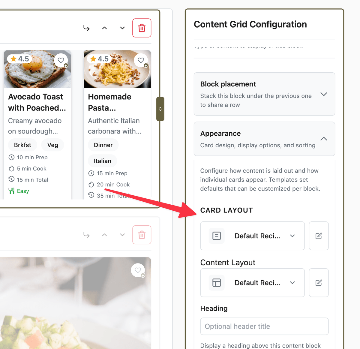
A card layout is a reusable template for one content type. Your Recipe layout controls every recipe card that uses it—what fields render, in what order, and with which visual style. It does not replace a recipe’s detail page (that is a content layout on the Content Layouts tab).
Two ideas often get conflated:
Card layout — which fields appear on the card (image, summary, meta chips, tags).
Card size on a Content Grid block — how many cards fit per row (compact, small, medium, large, feature). Size is density; layout is content.
Each content type has its own card layouts. Recipe layouts include recipe-specific options such as Time Display Options and difficulty/servings chips.
Where to start
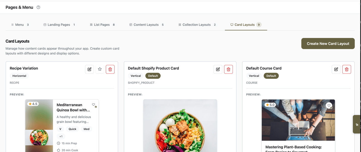
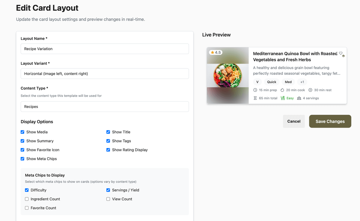
Open App Station → Pages & Menu and select the Card Layouts tab. You will see layouts grouped by content type. Open the default Recipe layout, or click Create New Card Layout and set content type to Recipe if you want a second style (for example a featured hero card for the home page only).
The editor shows a live preview on the right (or below on narrow screens) so you can compare variants before saving.
Choose the layout shape
Under layout variant, pick the silhouette that matches where the card appears:
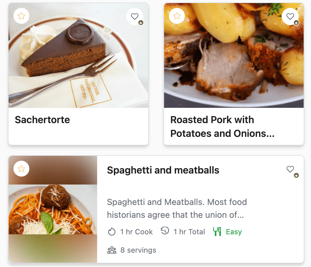
Vertical — image on top, text below; default for grids.
Horizontal — image left, content right; good for wider cards.
Compact — dense row layout for list-style grids.
Featured — larger hero-style card for highlighting one or two recipes.
Adjust image aspect ratio and image fit (cover vs contain) so portrait food photography crops predictably. Choose a card style preset—Classic, Sharp, Soft, Elevated, Flat, or Polaroid—to match your theme without hand-coding CSS.
Control what appears on each card
Use display toggles to show or hide:
Image (including video poster with play icon when cover media is video)
Title and Summary (with line clamp controls)
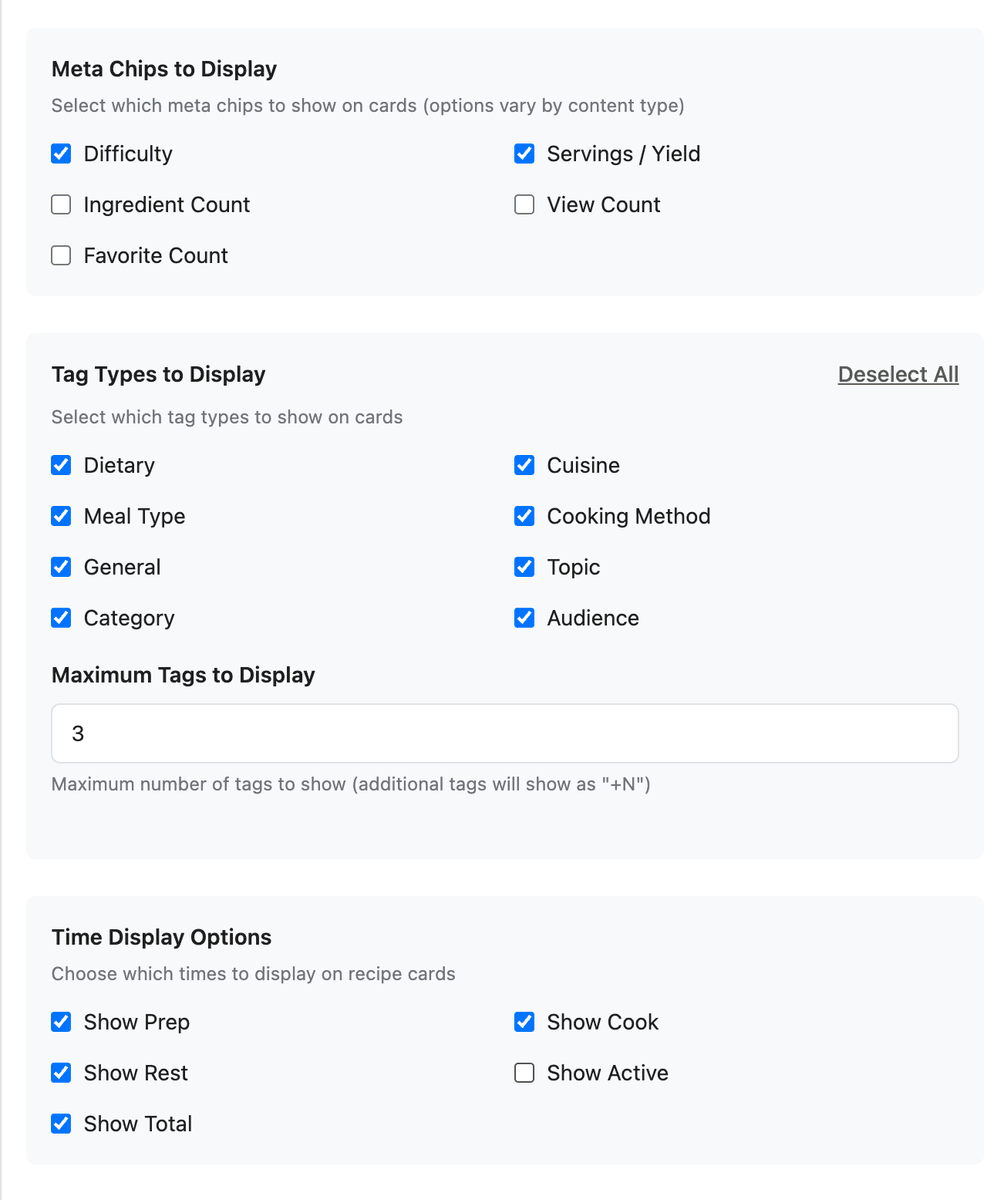
Tags — filter by tag types (Dietary, Cuisine, Meal Type, and others) and cap with max tags; overflow shows as “+N”
Favorite icon when favorites are enabled
Meta chips — difficulty, servings, view count, favorite count, and related recipe metrics
Recipe layouts add Time Display Options as separate toggles: prep, cook, additional (passive), active (prep + cook), and total time. A busy grid might show Total time and Difficulty only; a coaching brand might expose prep and cook separately.
Difficulty appears as a meta chip—not as a duplicate difficulty tag—so cards stay clean.
Preview, default, and wire to pages
Save the layout. Mark it Default for Recipe if it should be the tenant-wide fallback.
Open the page where recipes appear—often home or a library page—in Pages & Menu (Page Builder).
Edit the Content Grid block (or carousel block that lists recipes).
Set Card size for column density; open the card layout picker to choose this layout or leave default to use the Recipe default.
Publish the page and preview on mobile—title clamp and chip wrapping matter most on narrow widths.
Different grids can use different Recipe card layouts: a tight Compact layout on “All recipes,” a Featured layout on “Editor’s picks,” same recipes, different presentation.
What members see
Any grid, collection page, or search result that uses your block configuration renders cards with this layout. Cards link through to the recipe detail page using your Recipe content layout—card layout and detail layout are independent, which is why you can refresh browse UI without rebuilding recipe pages.
My Stuff grids use card size from system page settings; field visibility on those cards still comes from the default Recipe card layout unless you customize it. See My Stuff for density controls.
Quick-start checklist
Pages & Menu → Card Layouts → open the Recipe default layout.
Pick Vertical or Horizontal; set Card style to match your theme.
Turn off Summary if titles and images carry enough context; tune Time Display Options.
Limit tags to Dietary + Meal Type with max tags of 2 if chips feel noisy.
Save as Default; confirm your home Content Grid uses default or select this layout explicitly.
Load the library on phone and desktop; adjust line clamp if titles truncate awkwardly.
Recipe cards are your library’s packaging—invest ten minutes in the layout and every grid you publish looks intentional.